
Park Cities Addiction
BRAND IDENTITY
Park Cities Addiction was created around a different kind of approach to recovery. They recognize that healing doesn’t always happen in isolation. Their outpatient program is rooted in community, compassion, and a holistic understanding of the person behind the addiction, allowing clients to continue showing up for their families, work, and everyday lives while seeking a path toward sobriety.
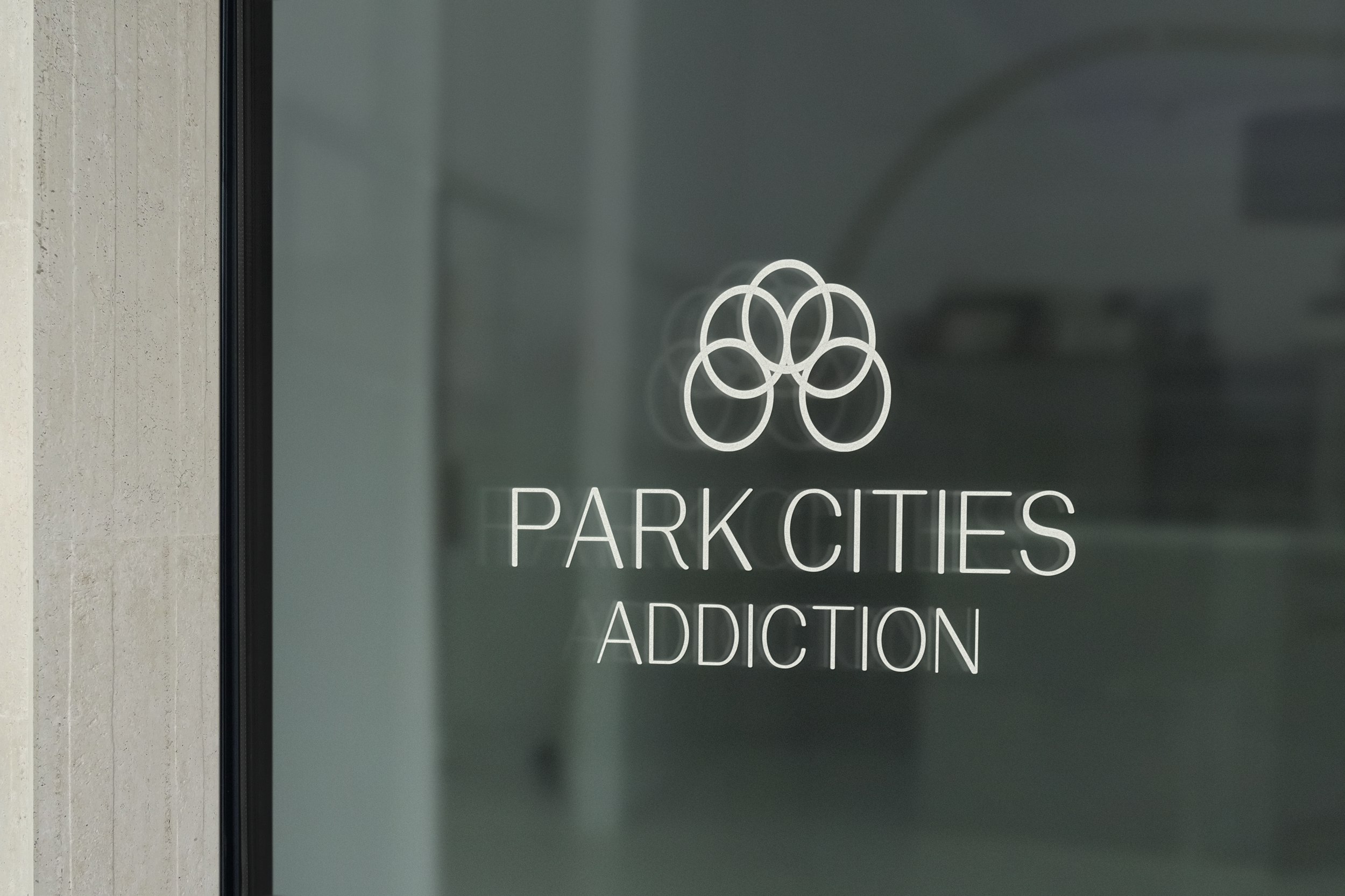
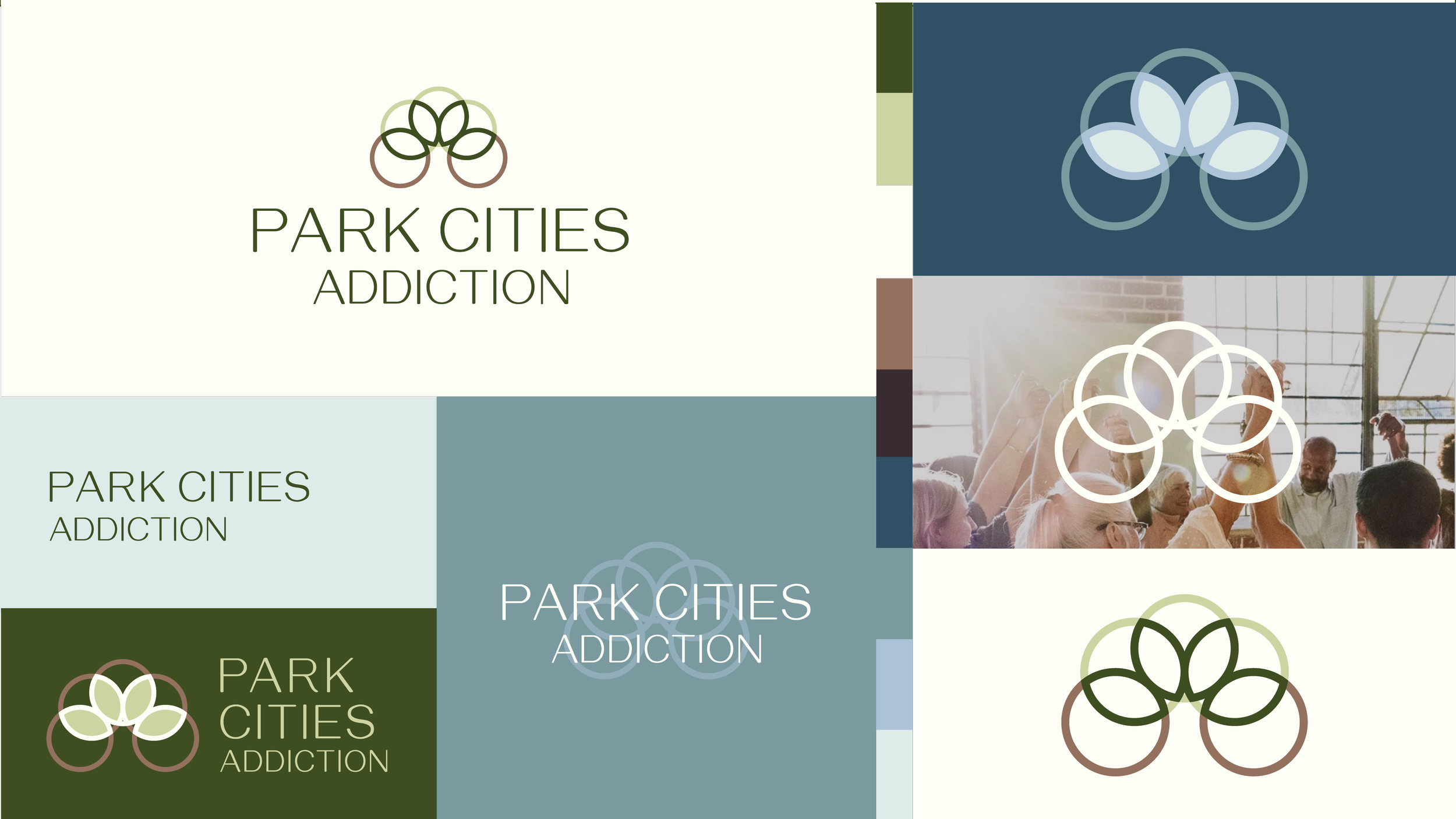
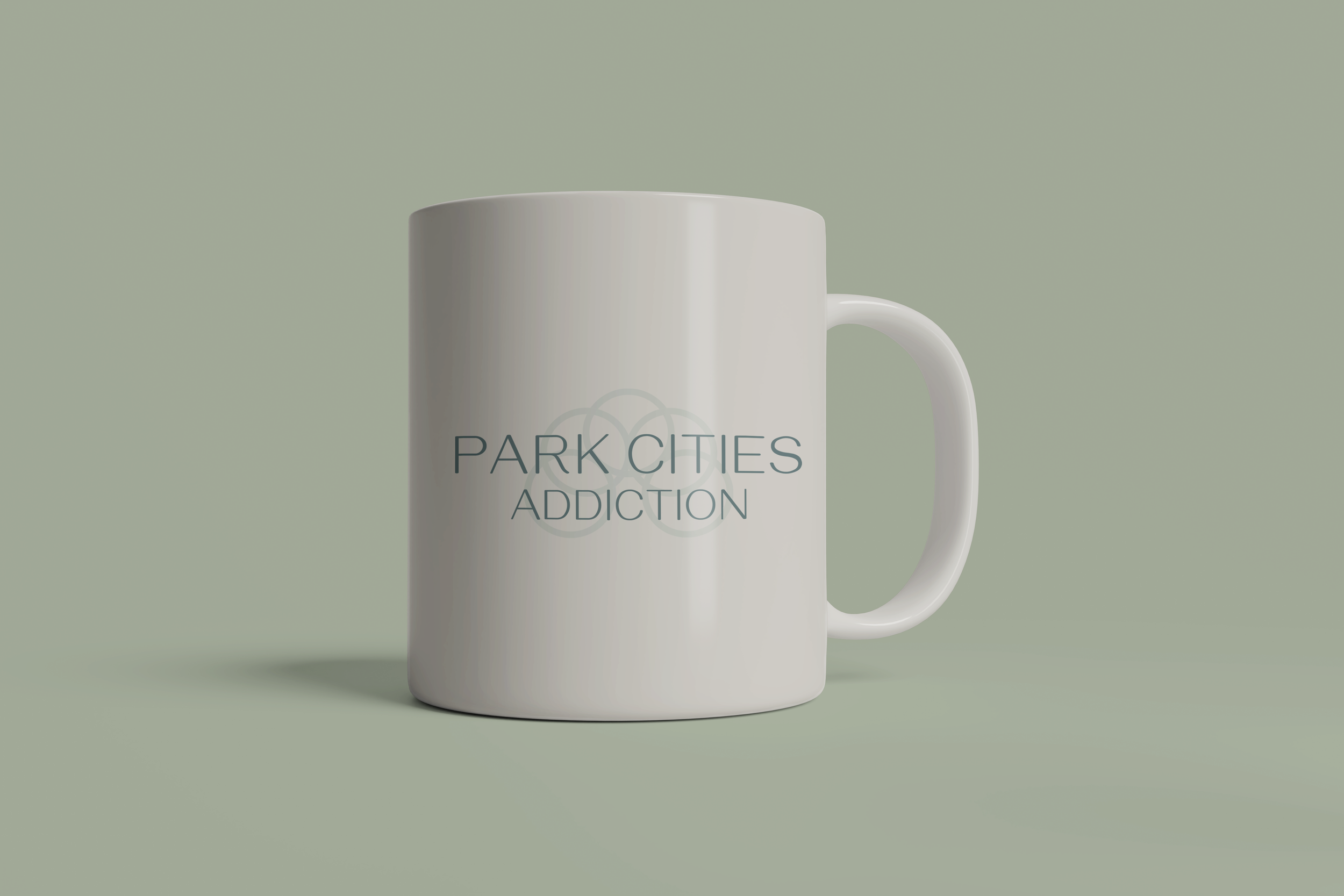
We wanted the brand identity to reflect that sense of connection, growth, and continuity. At its center is an organic symbol inspired by a growing tree and Venn diagram, with interconnected shapes representing the different stages and circumstances of life as they intersect with recovery. Rather than treating recovery as a separate chapter, the identity reflects it as something woven into the whole person and their everyday life.
The result is a brand that feels calm, grounded, and deeply human; creating a visual language for a place built around meeting people where they are and helping them find a way forward.
IN COLLABORATION WITH HINGE CREATIVE CO.